| Your body slides carry the detailed content of your presentation.
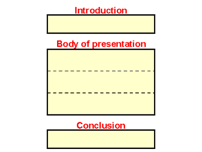
Where do the body slides fit into the presentation?
Naturally, the body slides follow the introduction:

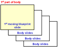
And each part in the body of the presentation begins with a moving blueprint
slide.

Tips for body slides
It's not within the scope of this Web
site to go into detail on designing body slides. But here are some quick
tips:
- Use a sans serif font. The most common are Arial
(for a formal tone) and Comic Sans (for an informal tone).
- Bold everything if you're using Arial. Otherwise
it looks too light when you project it. But you don't need to use bold
for Comic Sans (which is a heavier typeface than Arial).
- Use about 32-point type for titles and other text.
Use slightly smaller type to label graphs, etc.
- Use bullets instead of paragraphs. Sometimes you
have to use full sentences or short paragraphs, but make those the exception.
- Prefer images over words. Can you draw a picture
of what you're sayingperhaps with a flow chart, a decision tree, or
just a drawing (like the golf hole)? Why make your audience picture
something if you can picture it for them?
- Use a light background (usually white). Many colors
contrast with a light backgroundwhich makes it more versatile than
a dark background. Once you start using imageswhich usually require
several colorsyou'll be glad you're using a light background. That
way, your image will attract the audience's attentionnot your background.
Consider using a colorful background for the cover and blueprint slides,
if you wish.
A quiz
What's wrong with this body slide?

See if you can find several things wrong.
Ready to see the answer?
Through with the quiz? You're
ready to move on to . . .
Your next step
The next (and last!) slide in the model is the ending
slide.
Copyright
2007 by Edward P. Bailey
(all rights reserved)
|

